
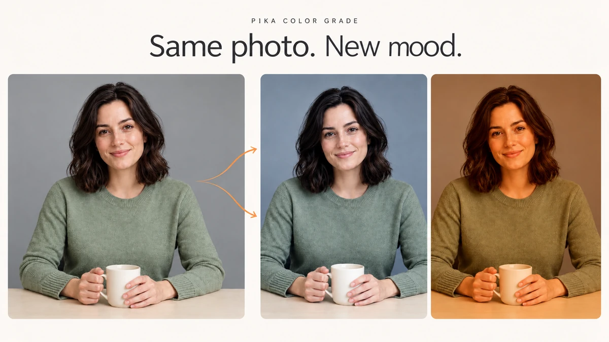
I used one portrait to make five colour grades in Pika: warm, cool, bright and soft, a subtle split tone, and a golden reference match. We kept the same starting photo for every setup so you can compare the changes.
The five generated images cost 35 credits in total: 7 each. See the results first, then follow the setup you prefer. Interface checked 9 October 2026.
Same photo, five looks






Open a photo to compare it at full size. Warm and cool gave us the clearest change. Bright and split tone stayed closer to the original; the golden reference match gave the strongest orange cast.
What is Pika Color Grade?
Pika Color Grade changes the colour and tone of a photo or clip. From Reference takes its colour direction from another image. Customize gives you sliders, shadow and highlight tints, and a Notes box.
I would use it to give creator photos a consistent mood, try a warmer campaign look, or reduce a cold colour cast. For a new light direction or time of day, start with Relight Media. For changing the mug, clothing or background content, use Edit Image.
Pick your workflow before spending credits
| Your goal | Start here | What to prepare |
|---|---|---|
| Match the mood of a photo you already like | From Reference | Your source and a reference image |
| Try a warmer or cooler version | Customize | One source; change Warmth first |
| Open up dark areas without a strong colour change | Customize | Brightness, Shadows and Highlights |
| Add coloured shadows and highlights | Customize | Two tint colours and Color strength |
| Keep product colours accurate | Small changes first | Compare your result with the original before using it |
These are five photo tests. The upload card also accepts a clip, but we did not generate a video for this guide. Check the current video controls and credit estimate after attaching your own clip.
Step 1: add the media you want to grade
- Open Color Grade.
- Click Add a photo or clip at the top.
- Choose Upload for a device file, or select a saved asset and confirm Use Selection.
- Wait for the preview, then choose From Reference or Customize.
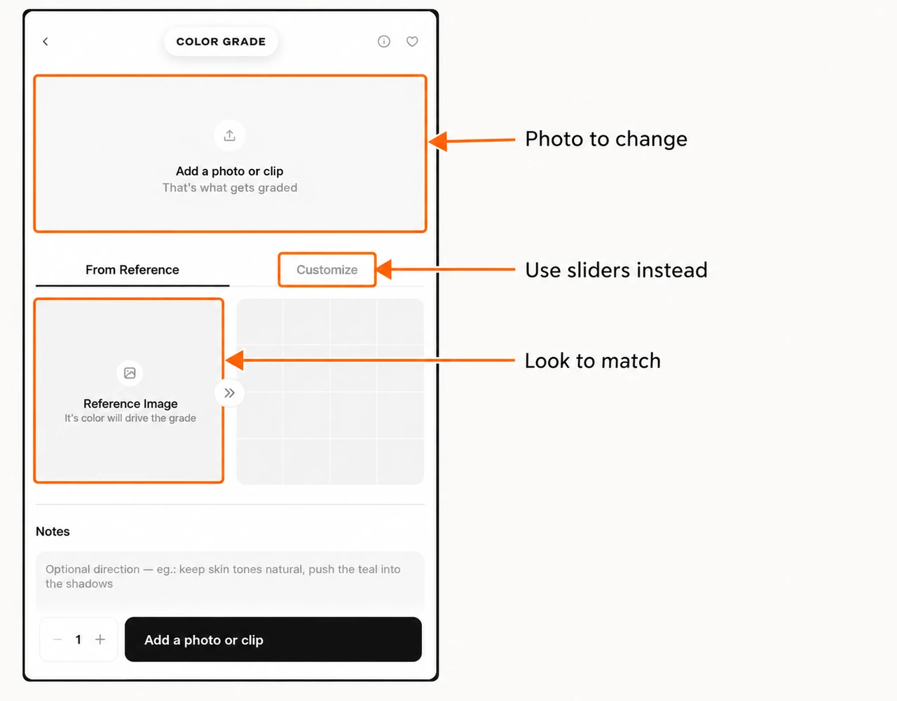
We uploaded a PNG copy of the original portrait. The website uses WebP copies. Use the cross on the source preview to replace it; keep the original attached when comparing settings.
Customize: set the look by hand
Step 2: adjust tone and colour
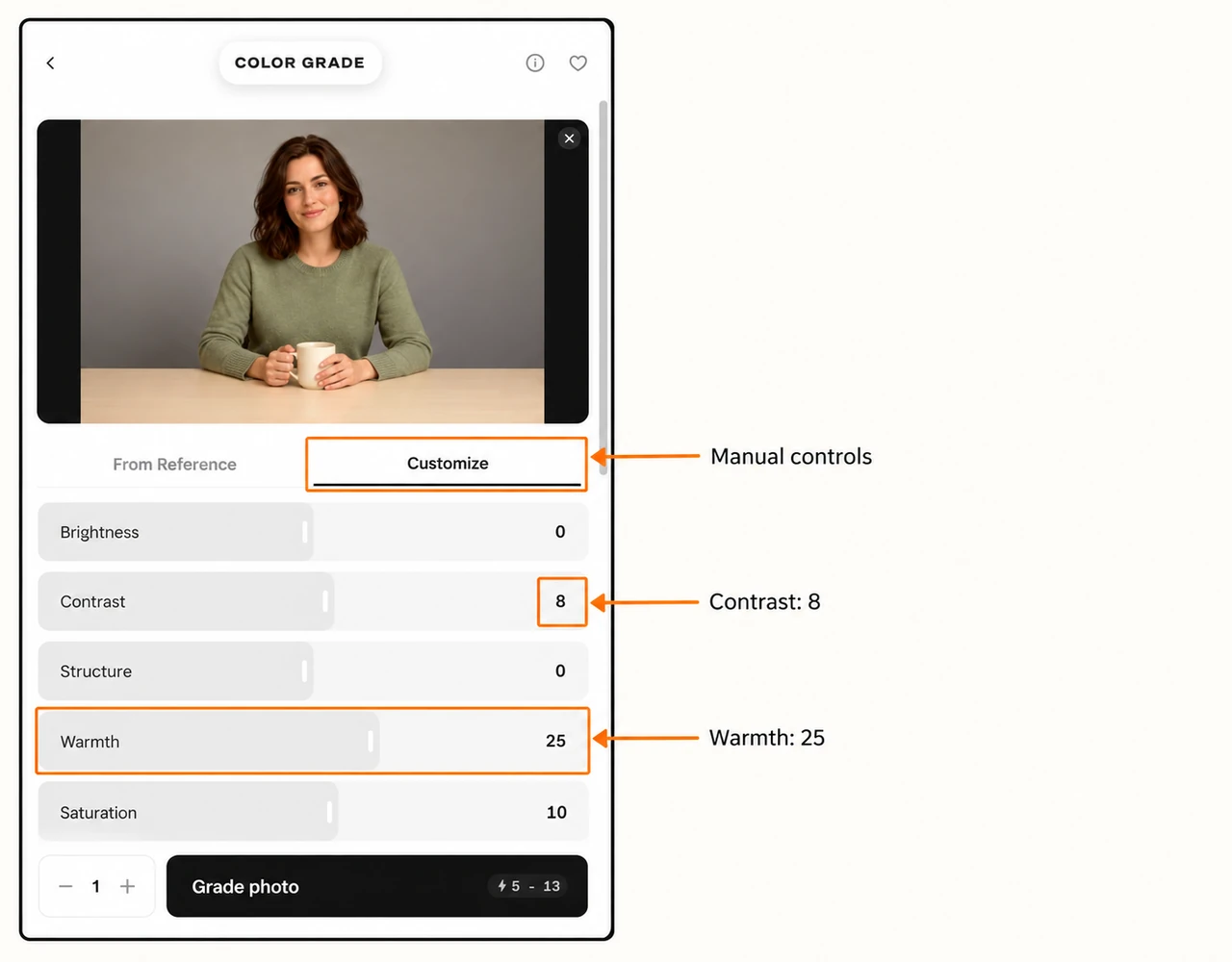
Select Customize. Move one slider at a time and watch the preview. The number on the right shows your setting. All sliders begin at 0.
| Control | Range | What I check |
|---|---|---|
| Brightness | −100 to 100 | Overall lightness; keep detail in the mug and face |
| Contrast | −100 to 100 | Separation between bright and dark tones |
| Structure | −100 to 100 | Local texture; inspect skin and knitted clothing |
| Warmth | −100 to 100 | Cooler or warmer colour direction |
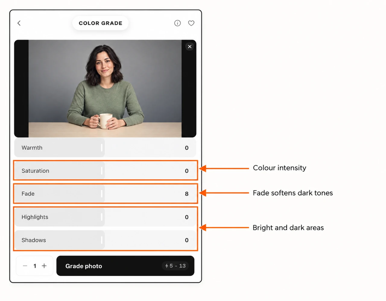
| Saturation | −100 to 100 | Colour intensity; watch skin and product colours |
| Fade | 0 to 100 | Softer dark tones; avoid a washed-out result |
| Highlights | −100 to 100 | Bright areas such as the mug and forehead |
| Shadows | −100 to 100 | Dark areas such as hair and clothing folds |
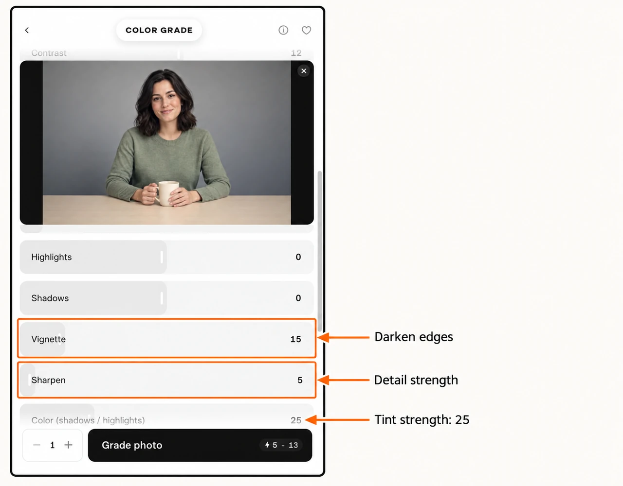
| Vignette | 0 to 100 | Darkening near the frame edges |
| Sharpen | 0 to 100 | Edge detail; inspect at full size |
| Color (shadows / highlights) | 0 to 100 | Strength of the two selected tints |
Step 3: choose tints, write notes and check the estimate
For split tone, select the Shadows colour chip and the Highlights colour chip to choose their colours. Then raise Color (shadows / highlights) to set the strength. The checked defaults were dark blue #1e2a44 and warm cream #ffd9a8; our split-tone setup changes the shadow colour to #243b53.
Write a short direction in Notes: the look you want and the objects that should stay. Use Reset between manual settings, then check all values again. In our test, Reset returned sliders to 0 but retained Notes, so I replaced the note for each setup.
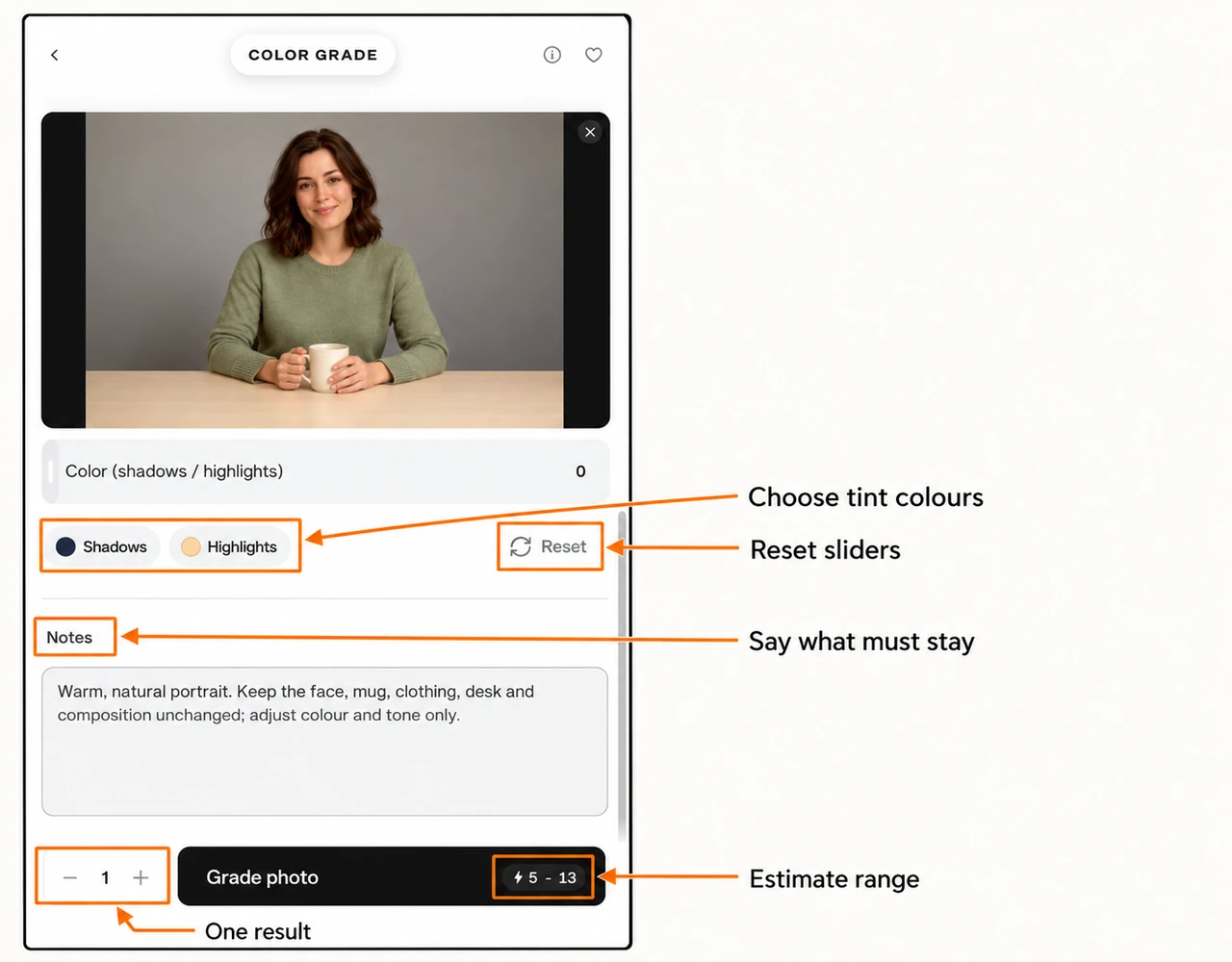
Keep Generations at 1. The plus and minus controls change the number of results you request. Recheck the estimate after changing the count or media.
Click Grade photo once your preview, note and estimate are ready. Open the completed result to judge the face, hands, mug colour and frame edges.
Four manual settings we tested
For each setup below: keep the original source, choose Customize, reset the sliders, enter only the listed changes, replace Notes, and request one result. Unlisted sliders stay at 0.
Setup 1: warm natural
| Setting | Value |
|---|---|
| Contrast | 8 |
| Warmth | 25 |
| Saturation | 10 |
Our exact note:
Warm, natural portrait. Keep the face, mug, clothing, desk and composition unchanged; adjust colour and tone only.
I would start here for a warmer creator portrait. Check the ivory mug against the original if its true colour matters.
Setup 2: cool restrained
| Setting | Value |
|---|---|
| Warmth | −25 |
| Contrast | 15 |
| Saturation | −12 |
| Highlights | −10 |
Our exact note:
Cool, restrained portrait tones. Keep natural skin detail and the same subject, objects, pose and framing.
This was a clear alternative to the warm version. I would compare these two first before making smaller adjustments.
Setup 3: bright and soft
| Setting | Value |
|---|---|
| Brightness | 10 |
| Contrast | −8 |
| Shadows | 20 |
| Highlights | −15 |
Our exact note:
Bright, soft portrait grade. Preserve natural skin, the green sweater and ivory mug. Keep all objects and composition unchanged.
I would try this when dark areas need attention but I do not want a strong warm or cool look.
Setup 4: subtle split tone
| Setting | Value |
|---|---|
| Contrast | 12 |
| Structure | 10 |
| Fade | 8 |
| Vignette | 15 |
| Sharpen | 5 |
| Color (shadows / highlights) | 25 |
| Shadow tint | #243b53 |
| Highlight tint | #ffd9a8 |
Our exact note:
Subtle blue shadows and warm highlights. Keep skin believable, preserve the ivory mug and green sweater, and keep the same scene and framing.
This is a starting setup for soft tinted shadows. I would only increase Color strength after inspecting the first result. Our soft and split-tone results look close in small cards.
From Reference: match the colours of another photo
Step 4: attach a reference image
- Keep the original portrait as the source.
- Select From Reference.
- Click Choose reference image and upload the photo whose colours you want.
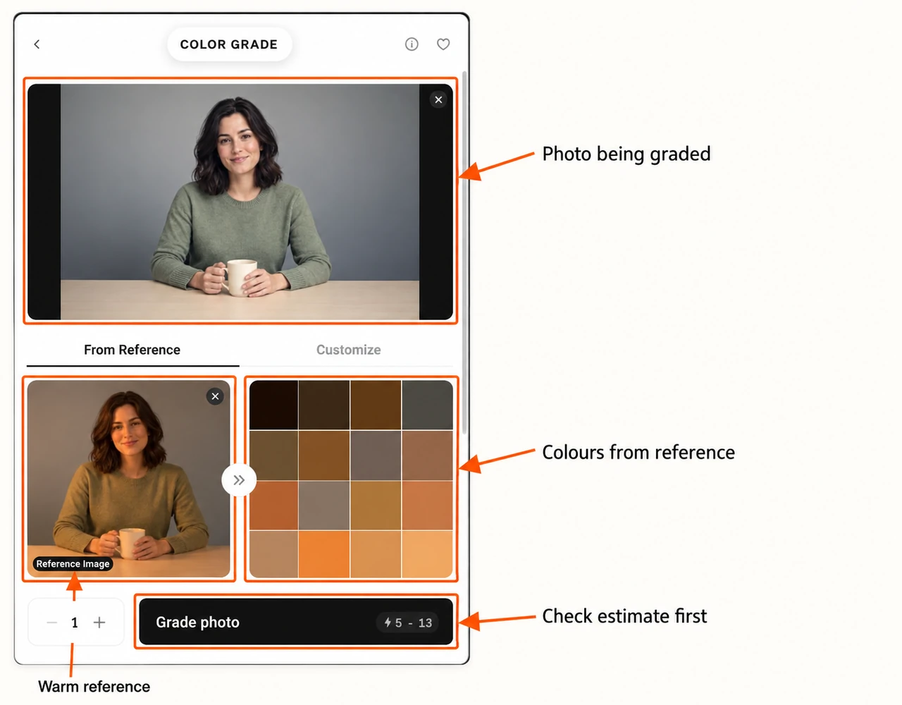
- Wait for its thumbnail and the colour palette beside it.
- Add a short note, keep Generations at 1, then check Grade photo and its estimate.

Setup 5: golden reference match
We used the golden-hour portrait as the reference. The workflow uses that image for colour direction; there are no manual sliders on this tab.
Our exact note:
Match the warm golden colour palette of the reference. Preserve the original face, green sweater, ivory mug, hands, desk and composition; do not copy objects from the reference.
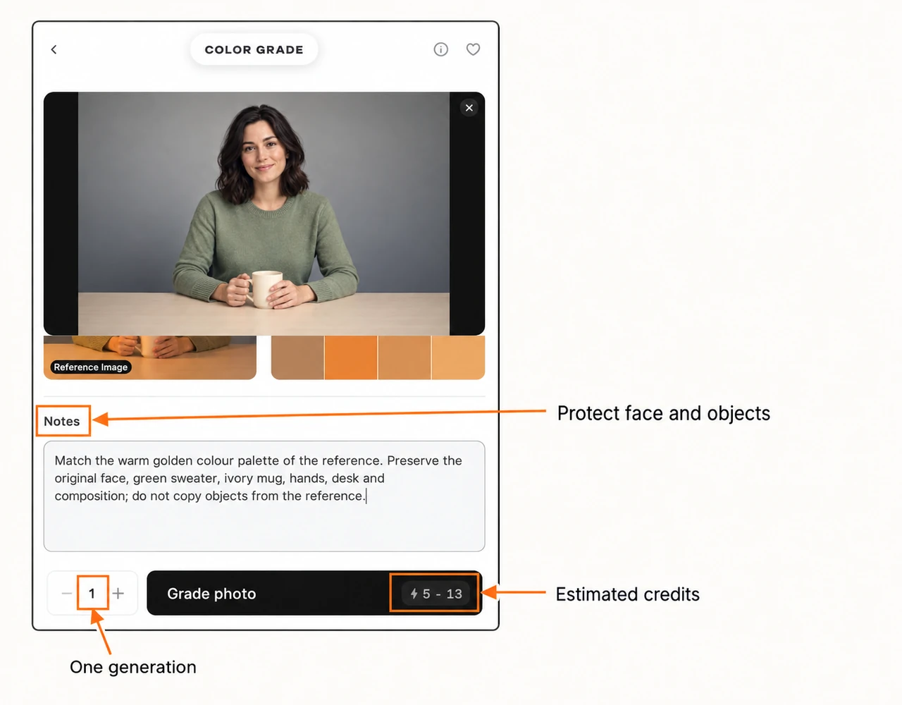
I would choose this workflow when I already have a useful colour reference. For this portrait, the match is quite orange; a gentler reference would be a better starting point for neutral skin tones.
Step 5: inspect and download the result
Open a completed image from your project. Compare it with the original before choosing Download in the top toolbar.
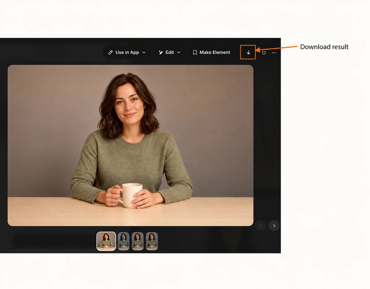
Our downloaded images were 1537 × 1023, while the source was 1280 × 853. These are the returned files from this test, not an upscale setting we selected. All five kept the same recognisable portrait and composition, but this is a generated edit: inspect fine details instead of assuming every pixel stays identical.
What did it cost?
| Item | Recorded in our test |
|---|---|
| Estimate shown before each run | 5–13 credits for one photo |
| Completed charge per image | 7 credits |
| Four manual grades | 28 credits |
| One reference match | 7 credits |
| Five settings total | 35 credits |
The account temporarily fell by 13 credits at submission and returned 6 after completion for each run. We checked the completed details, which recorded 7. Read a range such as 5–13 as an estimate range, not a fixed 5-credit price. Current media and settings can change the quote.
The photo form we checked did not show a model picker, resolution selector or duration control. Use the controls actually present for your attached media. Do not assume a video will use the same quote as these photos.
Make your first grade useful
- Choose one clear goal: warmer, cooler, softer, or a reference match.
- Start from the original for every comparison.
- Request one result before increasing the count.
- Inspect skin, product colours, hands and bright areas at full size.
- Keep the original and the selected grade together so you can judge the change later.
For a new object colour, use Edit Image. For changing light placement, follow Relight Media. Once your photo looks right, use our image-to-video guide to make a short clip.